My visit to Portfolio

It was corwded in the Gallery today, due to Portfolio. I think this setting, having Portfolio at the school instead of Benaroya, made it cozy in a way, familiar. Maybe because all the graduates were in close quarters with each other. It made the event just feel more familiar, close. I can’t it explain it better than that.

Benaroya Hall is a great place to be for Portfolio. Roomy, very scenic. But there is just something about having Portfolio here that creates more of a closeness, a unity, amongst the graduates I think.

So here is my selfie to prove I visited. Mind you I am running off no sleep.It is finals after all. Who needs sleep?

20141215_130909

20141215_133614

I spoke to Tressa, whom I have in Emerging Technologies, Danielle Moug, Moe Abbot and Secily Zepeda. I spent about 5 minutes talking to each, or less when a employer came by; I ducked out so they could focus on them.

Talking to them gives me a lot to think about, what I need to do for my portfolio. It seems so daunting, the things I have to come up with, and this has not been one of my better quarters. But I will keep pushing and doing the best I can. I aim to be doing my portfolio in about a year.

Week 7 Prelim Crit Notes

I sat with Adrian Aquino, Rob Bejach and Abdul Moiz for our preliminary critique.

Adrian mentioned that the labels on my PB and Jelly jars was plain. Needs some details, generic icon, (peanut for PB jar e.g.). He also suggested just listing the steps for making a PBJ sandwich; get bread, PB and jelly/jam, take out two slices of bread, open PB jar…..etc. I could possibly spin this as steps for children, like their first kitchen project.

Abdul said I should add a dark transparent background on the text fields that pop up.

Rob suggested using a 3D effect on the jar labels for the text. Also make the bread more 3D as well opposed to the flat view. Also use gradient tool for some more detail. Also use mesh tool for texture on jelly.

Scott mentioned the bread looked too tall and I need to work on the layout, draw up sketches visualizing a better layout. Use steps, (1,2,3 etc), and have text pop up in same area when selection is clicked or hovered over.

Project 2 Research

These are some of my choices for possible Project 2 subjects. They are all from Kickstarter.com.

RFID Reader

I chose this first one because I am in Emerging Technologies and we will be using Arduino boards. I think this could be like a mini introduction to that awesome tech for me. This project is for an RFID reader. The requester of funds will send you a DIY or fully assembled version of the product depending on the amount you would send him. What I could do is show the schematic for the board and list the different areas of it that pop-up when the cursor rolls over it

Off topic…do cursors really roll? The old style computer mice used to, but even then it wasn’t the cursor rolling. Anyway…

ard board

The Arduino schematic


Zubits

I thought this one was kind of silly. It removes the need for tying your shoes. I thought the 80’s with Vans and Velcro took care of that. But here it is, magnets on your laces.

shoesI have to admit they did a good job of selling the idea. The step out feature/function/thing seems legit.


Ok. I’m not feeling the Kickstarter thing so much. I’m not sure how I would create an interactive PDF off some of the entries I looked at. So I thought I’d go smart-ass and list some ideas for more every day type things and activities. Like…


Tying your shoelaces.
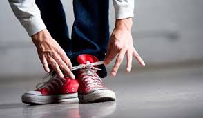
laces

You know why this one’s here.


Making Coffee (old school)

il_fullxfull.252649551

An ancient and solemn morning ritual. Before the onslaught of espresso and french press, before the drive through espresso stands, specialty roasts, blonde coffee and baristas, there was a time when 3-5 scoops, (depending on taste), a carafe of H2O and an ON switch was how you started your day before starting your day.

And nothing against drive-thru coffee stands. I thank the Lord of the Bean and All Else for them. I’m also thankful for good ol’ drip making it onto the menu of many coffee establishments. Americanos, a mock equivalent but one that I would not deny myself of when there is nothing else, just isn’t the same.


Peanut Butter and Jelly Sandwiches

I don’t know if this would be about making one or just describing its major components and ingredients and genetic makeup. The ideal PBJ, bread types, crunchy or smooth PB, natural vs regular, e.g. Jif, jellies vs jams. Cheese or not to cheese? These are just a few things to consider when constructing the consummate PB&J.

peanut-butter-and-jelly

Just cause…peanut-butter-jelly-time-15peanut-butter-jelly-time-15peanut-butter-jelly-time-15


End of Line

Week 4 Prelim Crit notes

Greg, Trent, Moiz, Alex

Overall everyone felt I was on target for representing the article. I did have to explain that I was doing a different article, so I will make sure that this is conveyed better in the PDF final. Once I also explained what else I was going to add to my final picture they better understood my intent. This goes back to having something to critic, and the more work there is the better the critic can be. I had spent my time having to back track some and redo my picture due to that I had changed articles. Someone also mentioned Ben Affleck’s head being above the theater; they thought it was a part of the theater or sign. I will need to do something to his head to show that he isn’t really there but that wherever he is, he is laughing because people will still see the movie despite any doubts about him making a good Batman.


Week 2 P1 classmate feedback

By Mary Anderson

  1. Review the article chosen. I have reviewed the article, “Does Ben Affleck measure up to other Batman actors?”, by nailbiter111. This article is an editorial.
  2. Is the article accurate and thoughtful? I do think the article is very thoughtful, and even hilarious at times. The fact that we are talking about Ben Affleck’s derriere is a funny and memorable one. The accuracy is unknown due to the fact that we are reviewing the opinions of the fans and not Mr. Affleck himself.
  3. Sketch review:I like sketches 1, (1st page, sketch #1) and 2, (2nd page, sketch #4). I like sketch 1 because you can clearly see the Batman logo being shown but, (no pun intended), instead of the logo being shot into the blue sky it’s being shown on Batman’s derriere! This sketch gets the point across in a funny and unique way. I like sketch 2 because it shows Batman in his birthday suit on the roof with the wind making his cape fly exposing his derriere again in all his glory!


P1 Editorial Project Research

Here are three articles I’m considering for Project 1. Please keep in mind, at the time of this writing I haven’t had the opportunity to completely read through each to get the complete feel of the writers opinions.

http://www.comicbookmovie.com/fansites/nailbiter111/news/?a=98931

This one is an article regarding the casting of Ben Affleck and his tush as the new Batman in the upcoming Batman v Superman movie.

http://www.dailyiowan.com/2013/10/04/Opinions/34997.html

On a more serious note, this article deals with mental health care and how there isn’t much relation with it to violence.

http://www.nytimes.com/2005/08/18/opinion/18morton.html?_r=0

And this is an article about artificial intelligence.

So I think I am going to do the Ben Affleck’s butt/Batman article. The mental illness/violence one was too serious for my taste and I know in my career I may have to do work on serious subject matter, but not today. The artificial intelligence article was just too blah for me. Too political, too un-funny. For whatever reason, I find Ben Affleck’s Batman butt very interesting.

The article calls into question Ben’s rear-end and if it can fill the pants, (not shoes), of Batman in the upcoming Batman v Superman flick. Are Ben’s cheeks worthy of the Batman? Does his keister fit the bill of what we have to come to expect of a true Batman’s butt?

To represent this article, I was thinking of a close up of the Bat’s rear end with the Batman logo filling in around the cleavage of the cheeks and wrapping around them. I imagineĀ  that I don’t want it to be obvious that people are looking at an ass, let alone the Bat’s. But I also have to represent Affleck in there somewhere and I’m not sure how I will do that yet. I still need to work on my thumbs for this, so I’m sure I’ll have more ideas as I do that.

Speaking of which, here are the pics now….

mag pic scans_Page_1 mag pic scans_Page_2 mag pic scans_Page_3 mag pic scans_Page_4 mag pic scans_Page_5


Week 1 Questionarre

1. What Quarter are you in? (approx), I am in my 3rd quarter here at AiS

2. What drawing experiences/classes have you taken/had? I have drawn off and on most of my life. I have taken and Design Fundamentals with Loucinda, Observational Drawing with Dave and Analysis of Form with Tony, as well as Digital Color Theory with Steve , and Concepts in Computer Graphics with Scott, that have helped me in digital drawing.

3. What experience have you had with image making software-

Illustrator? Just what I learned last quarter in Concepts in Computer Graphics.

Photoshop? More exposure in CCG, but my first taste was in Digital Color Theory with Steve Kramer

Other? I used MS Paint with great frustration when I was younger.

4. What is your favorite movie? The Avengers, anything LOTR related, Gladiator, Braveheart, The Lego Movie, Tron and Tron 2: Legacy, Tombstone, and many others.